If you're unsure whether the colours you've chosen are easily recognisable, or if you want to understand how a dashboard might be perceived by someone with a specific type of colour vision deficiency, there are various tools available to help. Coblis – the Color Blindness Simulator – allows you to simulate how an uploaded image would appear to people with different types of colour vision impairments. Some colour generation tools also offer the option to check how colours are perceived depending on the type of colour blindness. In addition, there are several tools for checking contrast levels, such as the Coolors Color Contrast Checker or the WebAIM Contrast Checker.
Do not convey information through colour alone
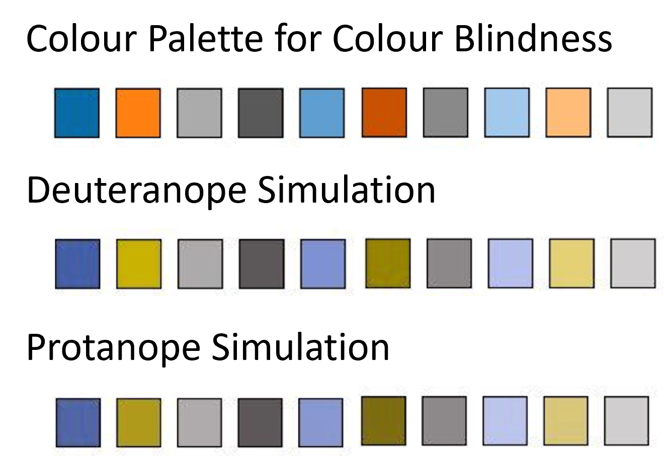
The human brain processes certain pre-attentive attributes more quickly than others. For people with normal vision, differences in colour are typically recognised faster than differences in shape. However, for individuals with colour vision deficiencies or colour blindness, the opposite is true – they are much better at distinguishing between different shapes. Using shapes can therefore make it easier to tell elements apart.
If it isn’t possible to use shapes in a chart, it’s important to ensure that a clearly labelled colour legend is provided. This allows everyone to interpret and understand the visualisation effectively.
Keep text readable
This topic often sparks debate: “Can’t we just set the font size to 7pt?” – all in an attempt to squeeze one more visualisation into the dashboard. But let’s go back to probabilities for a moment: around 67% of German adults wear glasses. That means there’s a fairly high chance that 7pt text is simply far too small to be legible. The recommended font size is 12pt. This is the standard used in most documents, so why not apply the same to reporting? Headings should also be easy to read – and can be slightly larger to aid clarity. If dashboards are intended for use on tablets or smartphones, it's essential to opt for even larger font sizes. In addition to font size, the choice of typeface plays a key role. Most modern reporting tools offer a wide selection of fonts, and the default ones are generally designed with readability in mind. But it’s not just the font and its size that determine how easily content can be read – text layout also matters. It’s important to ensure there is adequate spacing between individual values. When elements are too close together, the result feels cluttered and visually overwhelming – and above all, it becomes uncomfortable to read.
Create structure
This tip is more of a general recommendation, as it significantly improves the user-friendliness of any dashboard. A dashboard is made up of various elements, which should ideally be arranged into clearly defined sections. To ensure the most effective layout, it helps to consider common reading patterns.
Now, let’s take a closer look at the key sections of a dashboard:
- The header area should contain a clear and meaningful title, along with a brief description of the dashboard if needed, as well as additional information such as the data source's load date.
- The filter section is typically placed just below the header or aligned to the left. This area includes all interactive elements such as filter menus, navigation buttons, or export functions. It’s important to ensure that these controls are clearly and intuitively labelled.
- The main section is where the real content lives – it’s where all the visualisations are presented. The arrangement of these visuals should be carefully considered and grouped thematically. Various design elements can help enhance user experience. For instance, using borders to divide sections or group related topics can be highly effective. Clear labelling is crucial here – both axis labels and data points should be easy to understand. A descriptive title paired with a short explanation also adds value. Reading direction should be taken into account, and interesting “nuggets” of information should be placed where they naturally catch the viewer’s eye. This encourages users to spend more time engaging with the dashboard.
- The footer typically contains contact details, support information, or other supplementary content.
A well-structured dashboard is not only easier to understand, but also significantly more user-friendly for everyone. In fact, users tend to spend more time engaging with dashboards that are clearly and logically laid out. There are some fascinating eye-tracking studies that support this – and their insights can, of course, be applied to dashboard design.
Ensure keyboard accessibility
All elements should be fully operable without the use of a mouse. This depends in part on the tool used to build the dashboard or report. To ensure keyboard accessibility, there are a few key principles to follow. In general, all interactive elements – such as filter menus, dropdowns, navigation and download buttons – should be accessible using the Tab key. It helps if the currently selected element is visually highlighted, indicating focus. Most common BI tools already support this functionality. In addition, the logical reading order when navigating via the Tab key should be considered. Typically, users move line by line, from left to right – and the layout of the dashboard should reflect this. A particular challenge lies in features that are designed to work only with a mouse, such as drill-downs. In such cases, it’s important to offer alternatives, such as links that are triggered via hover text or keyboard shortcuts. Testing whether a dashboard can be operated with a keyboard is simple: just disable your mouse. Use the Tab key to move forward, and Shift + Tab to move back. It’s a test well worth doing 😉
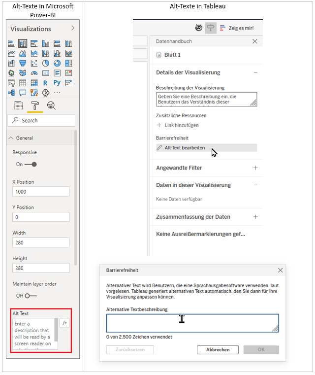
Alt text and labelling
These elements are essential for screen reader users (e.g. NVDA on Windows or VoiceOver on macOS). Screen readers read aloud all content displayed on screen. If alt text is present, it will also be read aloud.
In many cases, labels and explanations take up quite a bit of space, which often leads to them being hidden behind small info buttons. However, this approach isn’t very practical for users with impairments – especially those with cognitive limitations. Alt text offers a powerful alternative: it allows detailed explanations to be included without cluttering the visible layout. Screen readers can then present the content clearly, giving every user the opportunity to fully and correctly interpret the information.